Why GoodUI newsletter is so good
A couple of days ago I received my bi-weekly GoodUI newsletter from Jakub Linowski.
Writing emails is not an easy task, writing good emails is quite complex, and writing a newsletter is even harder — that’s why I’m quite surprised to realise I haven’t unsubscribed from it yet! :-)
And why are so good? Because Jakub applies lots of small and nice tricks — I tried to write them down and I got some great ideas I’d love to share.
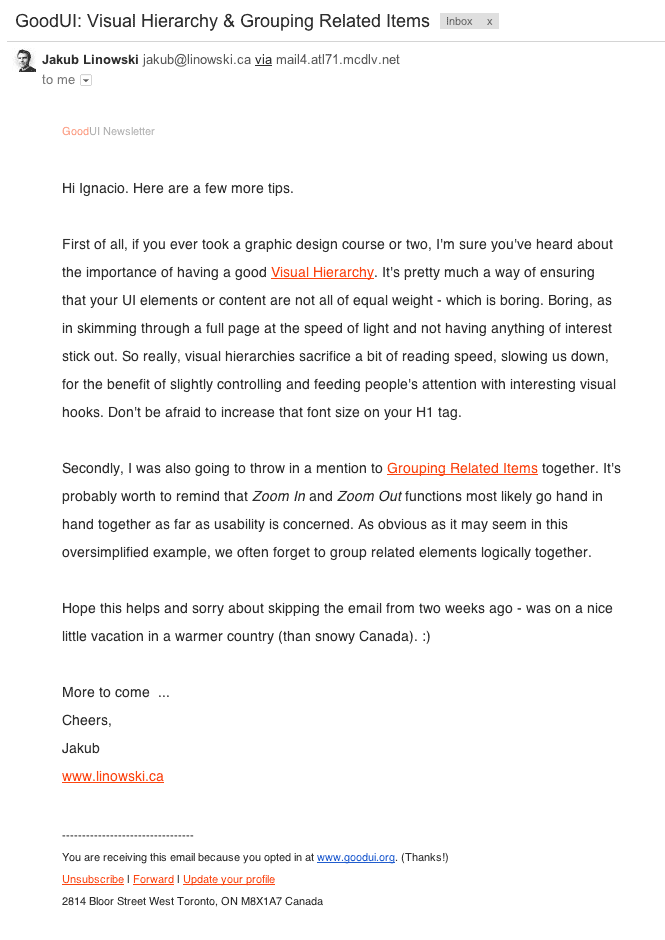
But first let’s show the email:

Why is this email working? Because…
The email feels personal
Let’s be clear: no ones likes automated emails. They are cold, impersonal and quite likely to end in the spam folder. So, what does the email do to fight against it?
He starts with a ‘Hi Ignacio’ — hey look, that’s my name! — this is a very powerful trick.
Dale Carnegie, author of the best seller How to Win Friends and Influence People, wrote:
If you want to win friends, make it a point to remember them. If you remember my name, you pay me a subtle compliment; you indicate that I have made an impression on you. Remember my name and you add to my feeling of importance.
Second thing: He sends the email from his personal email account. Is not a company, or a association. Is a real person, even Gmail shows his face (remember the effect of human faces)

Want to make it even more human? Jakub even finishes sharing some information about his personal life:
“Hope this helps and sorry about skipping the email from two weeks ago - was on a nice little vacation in a warmer country (than snowy Canada). :)”
When Jakub shares personal information two things happen:
1) Jakub feels more vulnerable, as he is revealing sensitive information other people can use, and
2) The reader feels more secure, safe and starts trusting more Jakub
Interesting, huh?
It just suggest some ideas
Nowadays there are tons of blog that are using fear to engage readers. I’m thinking about titles like:
- “Seven useful CSS3 selectors you don’t probably know”
- “Write bulletproof code with this three tips”
- “The 10 most common mistakes writing tests”
- “How I Made $10,000 From Google Last Month”
— Jesus! Seven CSS3 I don’t know! let’s click, because 1) I’m afraid there’s something out there I don’t know and 2) there’s some risk I can avoid just clicking the link.
This kind of trick works the first time, but is very easy to get fed of it — GoodUI newsletter suggest ideas in a cordial way, as a friend would do, not using fear and anxiety.
The email is short and well structured
And last, but not least, the email structure is as follows:
1) First say hello
2) One paragraph to introduce the first advice
3) Other paragraph to present the second one
4) Wrapping up and goodbye :-)
The better structured, the easier to read. Easy, isn’t?
Well, this are the main points I found. What you think about the email? Do you feel is effective? Can you find any other interesting element?
Cheers!