Interaction pattern research – add an image
Adding an image to a blog post, article or document can be achieved using different interaction patterns. This is a very quick research we’ve done for an internal project at ThoughtWorks.
Constrains: As an editor, I’d like to add an image to an article, in a web application, using a laptop computer, so I can engage users with a visually richer approach.
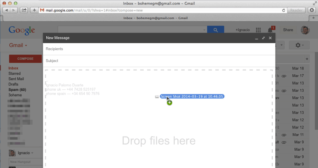
Drag and drop
Example: Microsoft Word, Gmail composer.

Pros: Easy to use, intuitive (for a subset of users or after learned), it also follows common operating system pattern to copy/move files. Lastly, it allows to drop the image in the exact place we want it to appear.
Cons: discoverability (there are no affordances that suggest you can drag and drop), hard to implement (cross browsing compatibility can be hard).
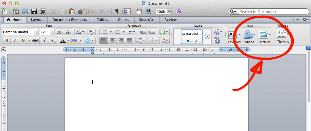
Button in toolbar
Example: Microsoft Word, WYSIWYG editors

Pros: Easy to discover (recognize the icon), easy to implement.
Cons: missing information about where the image will be placed — probably under the current cursor position.
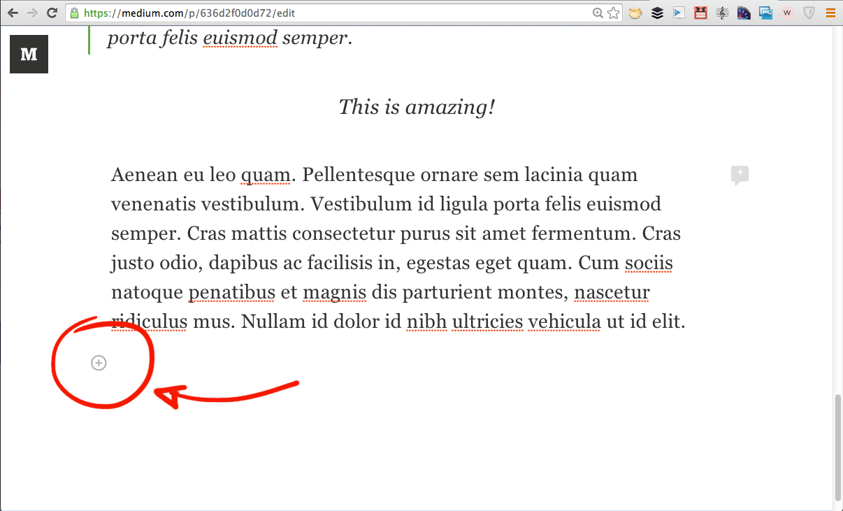
Visual cue
Example: Medium editor

Pros: shows where the image will be placed, clean interface (no clutter, avoid having a floating/distracting toolbar)
Cons: Not a common approach (maybe with a bit of learning curve), some rely on hover functionality (non touch friendly)