Be humble: less fields, more conversions
Be humble.
That’s a great rule we should try to apply in every scenario. With your friends, family, with your partner. And, of course, your everyday job and your user experience designs.
That’s exactly what I thought when I read the great No one wants to use your website by @seanthielen.
“No one wants to register for an account. People hate forms. Perhaps most importantly, people hate thinking“
Don’t ask for too much to your users. I’m so sorry to tell you, but they are not willing to give you their details, or their phone number. Remember the last time you were asked for your email? It was hard to hand it over, isn’t?
It’s hard to accept, but if you’re not one of the big guys, this is be probably true. And the sooner we realised, the better user-centered designs we can deliver.
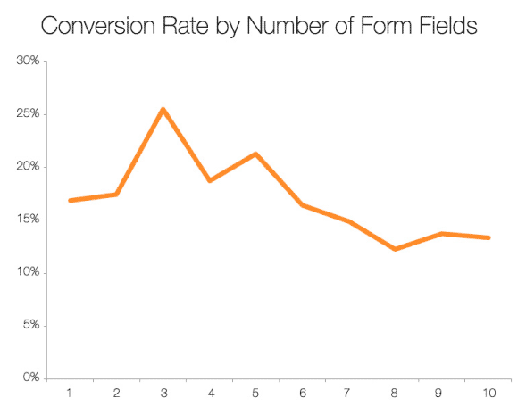
And now, the data to back up this:
Imaginary Landscape: Fewer fields in a contact form sharply increases conversions — going from an 11-field contact us form to a 4-field one resulted in a 160% increase in submitted forms.
HubSpot: Which Types of Form Fields Lower Landing Page Conversions? — an amazing analysis over 40,000 landing pages, showing for example that that going from four to three fields can improve conversion rate by 144%.
User Interface Engineering: The $300 Million Button — how changing a button increased a site’s annual revenues by $300 million.
Expedia case study — on how one extra data field can cost $12m.